While for many of us January offers a slower pace to ease into the new year, it represents probably the busiest time for our homeware buyers here at The Hut. With key industry events taking place across Europe this month, January offers a comprehensive view into the trends and products set to dominate the design landscape in 2018. Starting with Maison et Objet which opened its doors to us on 19th January for five days.
With hundreds of exhibitors showcasing at this year’s event, we came away from Maison et Objet feeling inspired and excited for what is set to be another hugely exciting and innovative year for homeware. Here, we run you through our picks from this January’s edition of Maison et Objet.
Futuristic Textiles from Tom Dixon
https://www.instagram.com/p/BeStHsQHdvo/?hl=en&taken-by=tomdixonstudio
https://www.instagram.com/p/BeLolD0nljQ/?hl=en&taken-by=tomdixonstudio
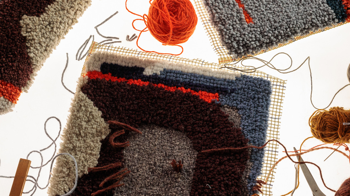
Always a highlight of our trips to Maison et Objet, Tom Dixon this season debuted a collection of textiles exploring knitting, weaving, knotting and digital printing techniques. Made up largely of cushions and throws, the collection depicted abstract urban landscapes with bold colours in an array of textiles while also presenting a new range of home accessories and fragrances.
Decadent Fun from Seletti
Loved for their witty, irreverent take on design, Seletti once more offered its intriguing perspective on homeware at this year’s event. Its collection featuring heart-shaped vases sculpted like actual organs and wonderfully eclectic stand saw the brand walk away with the prize for Best Stand.
https://www.instagram.com/p/BeS7EQZAczy/?taken-by=selettiworld
https://www.instagram.com/p/BeTY7dKgary/?taken-by=selettiworld
Jonathan Adler’s Monochrome Trip
https://www.instagram.com/p/BeTJVuBhSFg/?hl=en&taken-by=jonathanadler
Best known for its colourful take on Modern American Glamour, Jonathan Adler this season demonstrated how to create nostalgic glamour within a monochrome setting. The brand’s black and white stand was spattered with pops of colour and channelled a vintage ‘60s feel. Look out in 2018 for a move towards nostalgic monochrome interiors.
Chehoma’s Kids’ Corner
https://www.instagram.com/p/BeRNladBwlS/?taken-by=chehoma_official
Of all the aspirational interior images you have saved on Pinterest for inspiration, how many incorporate the daily realism of family life? Chehoma showcased how to embrace family living this year without comprising on style with an adorably chic kids’ corner.


